

Give a project, lesson, or collection a little room to make its case. Pair a recognizable visual with a strong title, a short description, and a clear way in. This is a candidate for the docs site; compare both examples before choosing where to use it. Return to the design workbench.
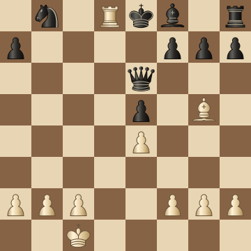
Follow a brilliant chess game and discover how a few well-placed pieces work together. A working board makes the explanation something you can explore.
A picture can set a completely different tone without changing the component. The title, prose, and links are ordinary Markdown. Their length determines the height; the component never crops the words to fit a card.
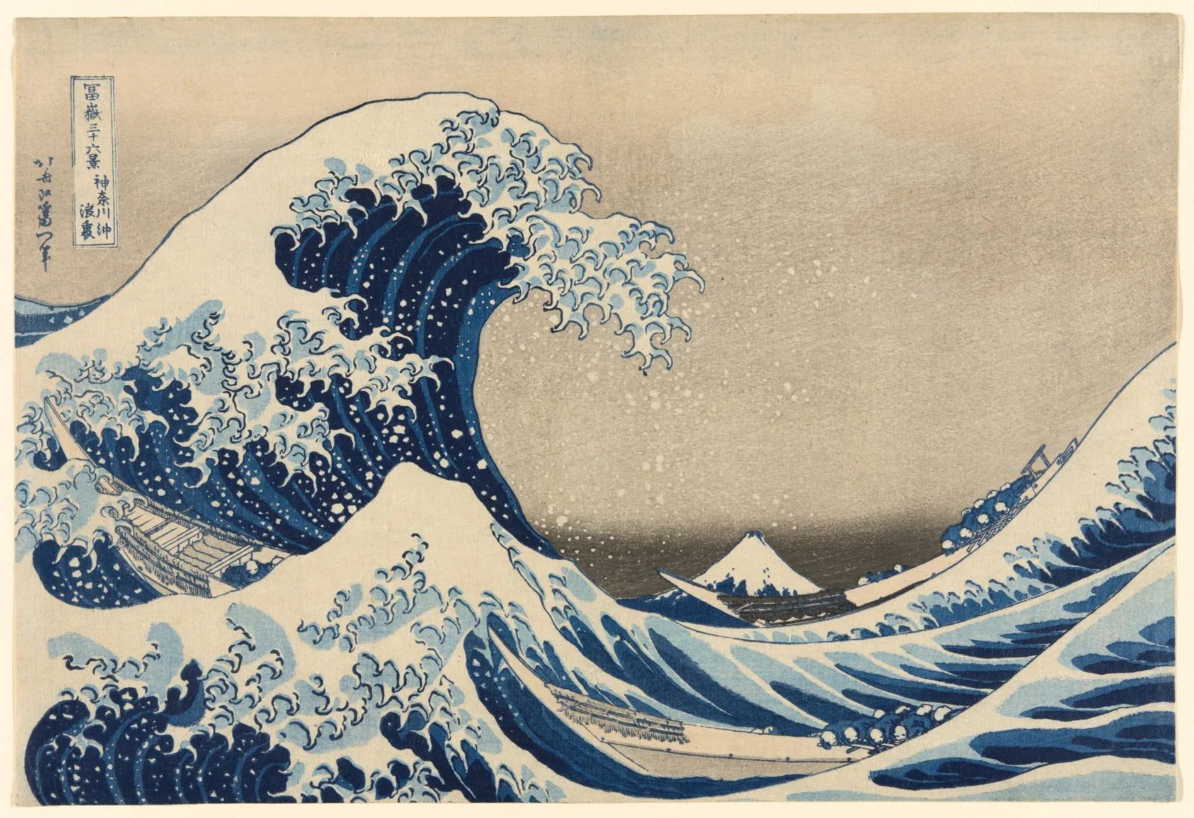
Look closer at three Hokusai prints. Compare their compositions, then discover how a crop changes the story.
Import the component and supply a visual slot. The remaining Markdown becomes
the caption. Keep interactive controls in the caption so a card can offer a
primary destination and a separate Source link without nesting links.
[@showcase]: ../design-system/showcase.components.md
<showcase-card>
<slot name="visual">

</slot>
## An idea, move by move
Explore an annotated game on a working chess board.
[Follow the game →](./chess/opera-game.demo.md)
</showcase-card>
Paths here assume a Source in the examples folder. Use local paths from the
Source that authors each image or link.
The visual gets a quiet, rounded surface; the caption stays on the page. That separation gives the image presence without turning every paragraph into a box. Both slots accept authored content, including other literate components.
<article class="pmx-showcase">
  <div class="pmx-showcase-visual"><slot name="visual" /></div>
  <div class="pmx-showcase-caption"><slot /></div>
</article>
Flexible columns respond to the space the component actually receives. In a wide Source they sit beside each other; in a narrow column they stack, with the visual first. This also works when Player changes the reading width.
.pmx-showcase {
  display: flex;
  flex-wrap: wrap;
  align-items: center;
  gap: clamp(1.5rem, 4vw, 3rem);
  margin-block: 1.5rem;
}
.pmx-showcase-visual {
  flex: 1 1 16rem;
  min-inline-size: 0;
  padding: clamp(1rem, 3vw, 1.75rem);
  border: 1px solid var(--pmx-color-border);
  border-radius: var(--pmx-radius);
  background: var(--pmx-color-surface);
}
.pmx-showcase-caption {
  flex: 1.1 1 18rem;
  min-inline-size: 0;
}
Images retain their full composition. Heading scale and link treatment belong to this pattern; color and typeface come from the active theme. There is no entrance animation to interrupt reading or presentation.
.pmx-showcase-visual img {
  display: block;
  max-inline-size: 100%;
  max-block-size: 24rem;
  inline-size: 100%;
  block-size: auto;
  object-fit: contain;
  border-radius: calc(var(--pmx-radius) / 2);
}
.pmx-showcase-visual > :first-child,
.pmx-showcase-caption > :first-child { margin-block-start: 0; }
.pmx-showcase-visual > :last-child,
.pmx-showcase-caption > :last-child { margin-block-end: 0; }
.pmx-showcase-caption :is(h2, h3) {
  font: 650 clamp(1.5rem, 2.5vw, 2rem)/1.15 var(--pmx-font-heading);
  letter-spacing: -0.025em;
  text-wrap: balance;
}
.pmx-showcase-caption p { text-wrap: pretty; }
.pmx-showcase-caption a:not(.pmx-heading-anchor) {
  display: inline-flex;
  align-items: center;
  min-block-size: 2.75rem;
  text-underline-offset: 0.25em;
}
.pmx-showcase-caption a:focus-visible {
  outline: 2px solid var(--pmx-color-accent);
  outline-offset: 4px;
  border-radius: 2px;
}
Use a showcase when the visual helps a reader choose what to explore. A gallery can repeat it with different content; a guide can use one to introduce its finished result. For a simple list of destinations, use a compact guide link.
To refine this design, change its template or CSS above and inspect both examples. Check a wide page, a narrow column, keyboard links, and Play before using the change across more Sources.