

A working section of the docs site for reviewing and refining its design system. These are candidates to try with real content before choosing where they belong on the main site. The components and their previews live in this repository.
Open a candidate to inspect its examples and literate implementation. We can compare designs here, revise them, and then incorporate the selected patterns into docs pages.
- Showcase — pair a visual with a story and a way in.
- Next step — give a guide or lesson a clear continuation.
- Small docs patterns — compact links, actions, and example/result layouts.
Candidate for example galleries and introductions to finished projects. Compare a chess lesson with an art collection in its Source. Review whether the visual earns its space and whether the caption makes the next action clear.
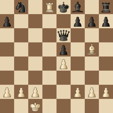
Give a lesson or project a visual identity and enough context to invite someone inside. Images, headings, descriptions, and links stay with the consuming Source.
Candidate for the end of a guide or a transition into practice. Review whether its emphasis helps the reader and whether it feels distinct enough from a callout.
- Open a pattern's Source and compare its working examples.
- Change the template or CSS in that Source and review the live previews.
- Try your own content in the slots before adding another option to the component.
- Check narrow widths, keyboard use, Focus, and Slides.
- Choose the design and its first destination before incorporating it into the docs.
Keep each substantial pattern in its own .components.md Source. The gallery
here composes those components; the individual Sources own their design and
implementation. The showcase and next-step designs are awaiting review; neither is adopted on
regular docs or example pages. The existing Authoring guide rows remain in use.