

Ordinary Markdown images work without configuration. The default Bun host generates responsive variants for local JPEG, PNG, and WebP files and preserves the originals.
Try this supplied image, also used by the Hokusai gallery:
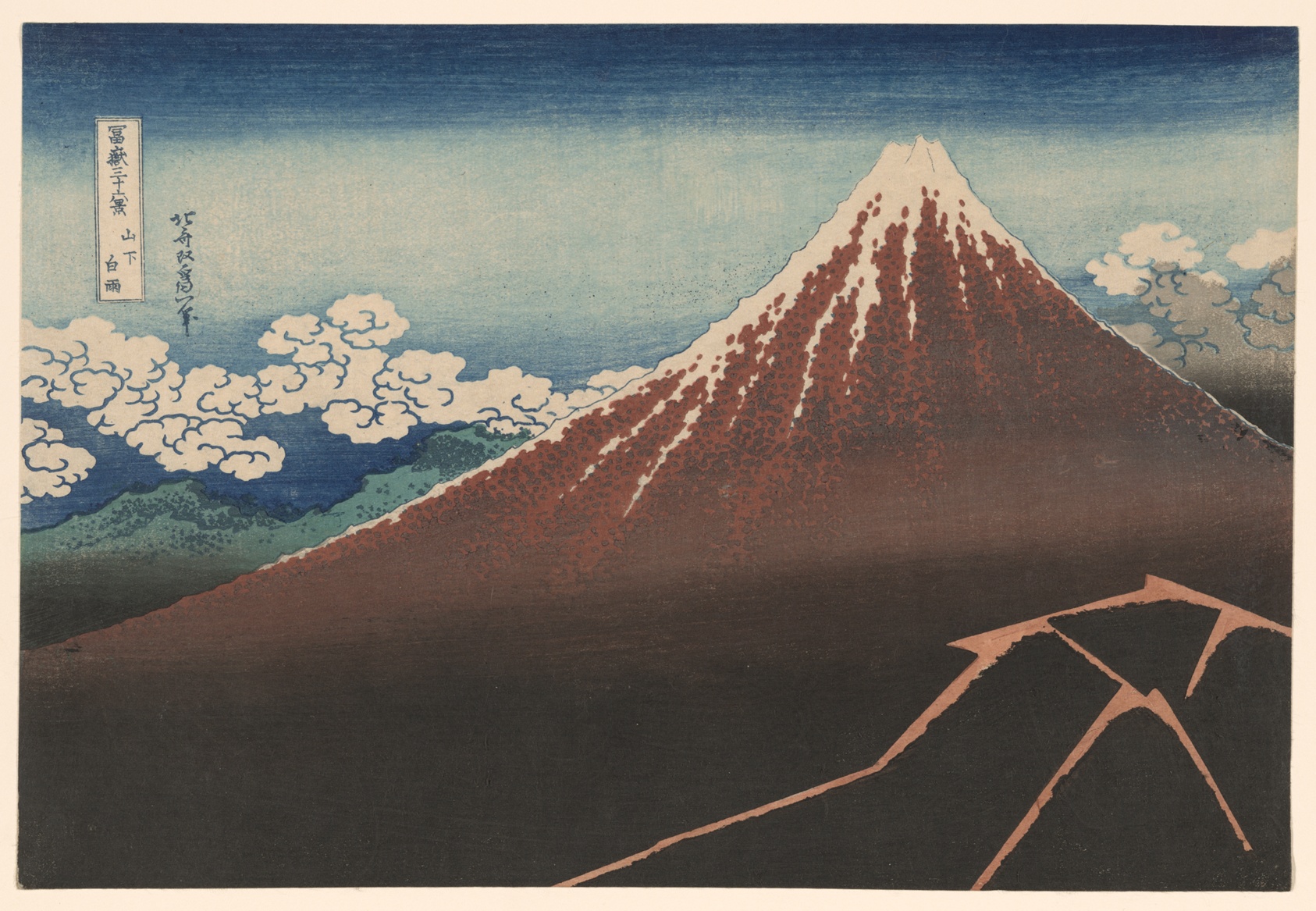

The image occupies a 220-pixel-wide box with a 4:3 aspect ratio. Select it to open the full composition. Closing the viewer restores focus and reading position, including in Player Focus and Slides.
For your own project, save the supplied original
as paths/assets/fuji.jpg. Create paths/images.page.md with the same directive
using ./assets/fuji.jpg, then run bun run dev and open /images.page.
The gallery identifies the public-domain artworks used in these examples.
Parameters follow the directive name, before qualifiers:
@image(width=220 ar="4/3" fit=cover).lightbox.
Separate named values with spaces. Quote strings containing spaces. Numbers and
booleans are unquoted; parameters are validated by the directive that owns them.
| Parameter | Meaning |
|---|---|
width, height | Positive integer CSS pixels, up to 16384. Images shrink to fit their container. |
ar | Aspect ratio: 1, 1.5, or "4/3". With one dimension, derives the other; alone, uses the container width. Do not combine both dimensions with ar. |
fit | contain shows the complete image; cover crops it to fill the box. Defaults to contain, or cover for backgrounds. |
position | Crop alignment: center, "center top", or "30% 50%". Defaults to center. |
sizes | An HTML responsive-image sizes string for layouts whose image width differs from the default. |
loading | eager or lazy. By default, the first image is eager and later images are lazy. |
fetchpriority | high, low, or auto. High priority is an explicit choice for a known critical image. |
decoding | async, sync, or auto. Defaults to async. |
format | Generated output: webp (default), jpeg, or png. |
quality | Integer from 1 to 100 for lossy JPEG or WebP encoding. PNG remains lossless. |
optimize | false serves the original without generating variants. Defaults to true. |
Width plus height also establishes a box.
Without width, height, or ar, @image stays in the reading column and
within a viewport-bounded height. Ordinary Markdown images keep their natural
size. Play Slides still use the slide frame.
Wrap images in data-pmx-gallery to give them one lightbox group in authored order.
The wrapper establishes membership; normal CSS controls the layout.
<div data-pmx-gallery>


</div>
Use .lightbox for a standalone image. Empty-alt decorative images and background
images do not open a viewer. A figure with a figcaption supplies a visible caption.
The viewer supports previous/next controls, arrow-key navigation at fit size,
plus/minus zoom, 0 to fit, arrow-key panning while zoomed, wheel zoom, dragging,
and touch pinch. Escape or the close button returns to the initiating image.
The original-image link opens the original file. Without JavaScript, image links
still navigate to that file.
An existing link to a page keeps its navigation behavior. To use a separate full
image, explicitly opt into .lightbox on a linked thumbnail:
[](./assets/desk-full.png)
The thumbnail's alt describes the thumbnail. For a different full image, supply
its own description on an HTML anchor with data-pmx-lightbox-alt when needed.

## A walk through the woods
The Block's authored content appears over the image.
Backgrounds are decorative and cannot also use .lightbox. Choose text and
background colors that keep the content readable.
In the document and Focus, a background-only Block still shows the image in a readable box. When the Block also has authored content, that content appears over the image. Slides still fill the viewport.
Development, rendering, and static publishing generate needed variants automatically.
Fixed-width images request 1× and 2× candidates; fluid images use a bounded width
ladder. Explicit sizes can describe a narrower column or grid slot. Lightbox
previews use larger candidates and load the original when zooming into detail.
Bun 1.4 generates resized files and uses CSS for cover cropping. A narrow crop of
a wide original can therefore transfer more pixels than a physically cropped file.
The complete image remains available in the viewer.
JPEG inputs default to lossy WebP at quality 82. PNG and WebP inputs default to
lossless WebP to protect text and diagrams. Animated PNG/WebP, GIF, SVG, unsupported
formats, remote URLs, and authored picture/srcset markup pass through unchanged.
Conversion failures warn and retain the original. Processing is limited to 64 MiB
and 64 megapixels per input; use optimize=false for larger originals.
The Bun host stores reusable, content-addressed variants under
.pathmx/cache/images in the project directory. Its disk cache is pruned to a
256 MiB budget. Generated URLs retain the original asset's access boundary.
Static output includes the referenced variants and relocates their URLs with the
publication base path. Portable hosts can provide their own processor; without
one, image presentation and the lightbox still work.
bun run pmx image optimize --dry-run
bun run pmx image optimize
The command examines authored image uses, including their requested sizes, and reports generated, cached, skipped, or failed results. Dry-run plans the widths without writing variants. Original files are never overwritten.