

Build a small library with covers you can browse and shelves you can fill. Four components work together: a wooden bookcase, rows of shelves, books that open their own notes, and a cover stage for each book page. Each Block combines an explanation with its working HTML and CSS.
See the bookcase for a collection filled by queries.
reading-bookcase holds a stack of shelves. Its default slot lets a page choose
how many rows to include and which books belong together.
data-pmx-beats="explicit" makes the covers inside the bookcase its Player
Beats. The frame and shelves remain visible while Player steps through books.
<div class="reading-bookcase" data-pmx-beats="explicit"><slot /></div>
Vertical grain and a dark coffee stain give the back panel a warm maple finish. The ledges use horizontal grain and a lighter face to catch the light. Transparent gradients add light and shade over the grain. Inset shadows recess the back panel behind the frame; the texture stays local to this example.
.reading-bookcase {
  --wood-grain: url("/examples/bookcase/assets/oak-grain.webp");
  --wood-panel: url("/examples/bookcase/assets/coffee-maple.webp");
  margin-block: 2rem;
  padding: 10px 10px 22px;
  border: 8px solid #4e2817;
  border-radius: 10px;
  background:
    linear-gradient(90deg, #210b0866, #fff0 22% 78%, #210b0855),
    linear-gradient(#48201322, #48201322),
    var(--wood-panel);
  background-size: auto, auto, 640px 640px;
  background-color: #62351f;
  box-shadow: inset 0 2px 2px #fff4, inset 0 0 0 2px #5b351944,
    inset 0 10px 22px #200c0877, 0 2px 3px #0002, 0 20px 36px -18px #34251980;
}
.pmx-document[data-pmx-play] .reading-bookcase > .reading-shelf { opacity: 1; }
reading-shelf holds one row. Add books directly or place a query in its slot.
On narrow screens, scroll the row sideways to reach more books.
<div class="reading-shelf">
  <div class="reading-shelf-books" tabindex="0" role="group" aria-label="Books on this shelf"><slot /></div>
</div>
The books share a baseline just above a continuous wooden ledge. Its bright top edge catches the light; its shadow falls onto the row below. The scrolling area has space above the covers for focus outlines and a small hover lift.
.reading-shelf {
  position: relative;
  padding-bottom: 18px;
}
.reading-shelf::before {
  content: "";
  position: absolute;
  inset: auto 4px -23px;
  height: 24px;
  background: linear-gradient(#38200b60, #38200b00);
  border-radius: 0 0 50% 50%;
  pointer-events: none;
}
.reading-shelf::after {
  content: "";
  position: absolute;
  inset: auto 0 0;
  height: 18px;
  border-radius: 2px;
  background: linear-gradient(#d8a47950, #d8a47910 22%, #24110a30 40%, #24110a90),
    linear-gradient(#44251be8, #44251be8), var(--wood-grain);
  background-size: auto, auto, 640px 320px;
  background-position: 0 0, 0 0, 0 45%;
  background-color: #62351f;
  box-shadow: inset 0 1px #e4bd8e66, inset 0 -1px #49291280, 0 3px 4px #38200b44;
  pointer-events: none;
}
.reading-shelf-books {
  display: flex;
  align-items: end;
  justify-content: safe center;
  gap: clamp(18px, 4vw, 36px);
  padding: 42px 24px 0;
  overflow-x: auto;
  scrollbar-width: thin;
  scrollbar-color: #735641 #b09a84;
}
.reading-shelf-books > .pmx-query-results { display: contents; }
.reading-shelf-books:focus-visible {
  outline: 2px solid #fff;
  outline-offset: -3px;
}
@media (max-width: 480px) {
  .reading-bookcase { padding: 6px 6px 14px; border-width: 6px; }
  .reading-shelf-books { padding: 28px 12px 0; }
}
reading-book opens a book’s notes in a modal. Its href, title, author, and isbn
attributes can come from a query or be written directly. The ISBN selects a
cover stored alongside this example.
The link's accessible name includes the title and author. A native tooltip provides the same information when hovering over the cover.
<a class="reading-book" data-pmx-source-open="overlay" data-pmx-beat="book-{{ isbn }}" href="{{ href }}" aria-label="{{ title }} — {{ author }}" title="{{ title }} — {{ author }}">
  <img src="/examples/bookcase/covers/{{ isbn }}.jpg" alt="" width="140" height="210" loading="lazy" />
</a>
A slim highlight and shaded spine make each cover feel like a bound object. The books lift slightly on hover or keyboard focus. Reduced-motion preferences keep that change immediate.
.reading-book {
  position: relative;
  display: block;
  flex: 0 0 auto;
  width: clamp(94px, 12vw, 132px);
  border-radius: 3px 5px 2px 2px;
  box-shadow: 2px 0 2px #0004, 5px 4px 8px #0004;
  transform-origin: bottom center;
  transition: transform 160ms ease-out, box-shadow 160ms ease-out;
}
.reading-book img {
  display: block;
  width: 100%;
  height: auto;
  aspect-ratio: 2 / 3;
  object-fit: cover;
  margin: 0;
  border-radius: inherit;
  outline: 1px solid #fff2;
  outline-offset: -1px;
}
.reading-book::after {
  content: "";
  position: absolute;
  inset: 0;
  border-radius: inherit;
  background: linear-gradient(90deg, #0003, #fff2 2%, #0002 4%, transparent 7%, transparent 96%, #0002);
  box-shadow: inset 0 1px #fff4;
  pointer-events: none;
}
.reading-book:hover, .reading-book:focus-visible {
  transform: translateY(-5px);
  box-shadow: 3px 4px 4px #0003, 7px 10px 12px #0003;
}
.reading-book:focus-visible { outline: 3px solid #243e50; outline-offset: 4px; }
@media (prefers-reduced-motion: reduce) {
  .reading-book { transition: none; }
}
.pmx-document[data-pmx-play] .reading-book[data-pmx-play-state="active"] {
  transform: translateY(-5px);
  outline: 2px solid #f7dfb8;
  outline-offset: 4px;
  box-shadow: 3px 6px 12px #160a0780;
}
Each cover is a Beat named from its ISBN, such as book-9780399590504.
In Focus or Slides, Player highlights the selected book. A player:beat-enter
listener scrolls the shelf horizontally to reveal it. Player handles the
page's vertical movement; the component handles its own row.
on(el, "player:beat-enter", () => {
  const row = el.closest(".reading-shelf-books")
  if (!row) return
  const book = el.getBoundingClientRect()
  const shelf = row.getBoundingClientRect()
  const scale = shelf.width / row.offsetWidth
  row.scrollTo({
    left: row.scrollLeft + (book.left - shelf.left + book.width / 2) / scale - row.clientWidth / 2,
    behavior: "instant",
  })
})
Place three novels on the first shelf and a mix of memoir and classics on the
second. Add another reading-shelf to grow the collection. Each row scrolls
independently on small screens.
[@books]: ./shelf.components.md

<reading-bookcase>
  <reading-shelf>
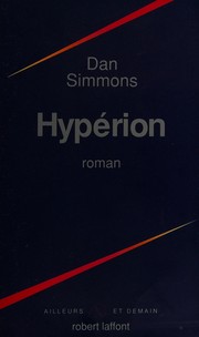
    <reading-book href="/examples/bookcase/books/hyperion.book" title="Hyperion" author="Dan Simmons" isbn="9780553283686" />
    <reading-book href="/examples/bookcase/books/neuromancer.book" title="Neuromancer" author="William Gibson" isbn="9780441569595" />
    <reading-book href="/examples/bookcase/books/left-hand-of-darkness.book" title="The Left Hand of Darkness" author="Ursula K. Le Guin" isbn="9780441478125" />
  </reading-shelf>
  <reading-shelf>
    <reading-book href="/examples/bookcase/books/educated.book" title="Educated" author="Tara Westover" isbn="9780399590504" />
    <reading-book href="/examples/bookcase/books/pride-and-prejudice.book" title="Pride and Prejudice" author="Jane Austen" isbn="9780141439518" />
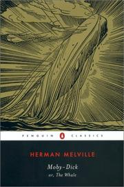
    <reading-book href="/examples/bookcase/books/moby-dick.book" title="Moby-Dick" author="Herman Melville" isbn="9780142437247" />
  </reading-shelf>
</reading-bookcase>
The @preview import at the top of this file makes these components available
for the working example below. Select any cover to open the book's notes.




reading-book-cover gives a book page the same maple backdrop as the shelf.
Pass isbn to select a local cover and title for its accessible description.
The figure, cover, wood texture, overhanging ledge, and mobile sizing stay together
in this component; reading-book-card arranges the cover and notes.
<figure class="book-cover-stage">
  <img src="/examples/bookcase/covers/{{ isbn }}.jpg" alt="Cover of {{ title }}" width="200" height="300" />
</figure>
The ledge extends 10px beyond the backdrop on each side. The image keeps its natural proportions and rests above the ledge. On small screens the cover shrinks to leave room for the book's title and notes.
.book-cover-stage {
  position: relative;
  display: grid;
  place-items: center;
  align-self: stretch;
  min-width: 0;
  margin: 0;
  padding: clamp(2rem, 5vw, 4rem) 2rem 2.5rem;
  border-radius: 6px;
  background:
    linear-gradient(90deg, #210b0855, #0000 25% 75%, #210b0855),
    url("/examples/bookcase/assets/coffee-maple.webp") center / 640px;
  box-shadow:
    inset 0 1px 1px #fff3,
    inset 0 0 24px #200c0855;
}
.book-cover-stage::after {
  content: "";
  position: absolute;
  inset: auto -0.625rem 1.5rem;
  height: 1rem;
  border-radius: 2px;
  background:
    linear-gradient(#d8a47955, #44251bdc 35%, #24110ac0),
    url("/examples/bookcase/assets/oak-grain.webp") center / 640px 320px;
  box-shadow:
    inset 0 1px #e4bd8e88,
    0 7px 10px #160a0777;
}
.book-cover-stage img {
  display: block;
  width: min(100%, 15rem);
  height: auto;
  margin: 0;
  border-radius: 2px 4px 3px 2px;
  box-shadow:
    2px 0 2px #0005,
    8px 10px 18px #160a0799;
}
@media (max-width: 40rem) {
  .book-cover-stage {
    padding-top: 2rem;
  }
  .book-cover-stage img {
    width: min(60%, 11rem);
  }
}
Import the component file beside the book's layout declaration:
[@layout]: ../book.layout.md
[@books]: ../shelf.components.md

<reading-book-cover isbn="9780441569595" title="Neuromancer" />
reading-book-card owns the content presentation, so it works on a full page,
in a modal, or in a reference. Its columns respond to the available space.
The page layout supplies only site navigation and the back link.
<div class="reading-book-card-container">
  <article class="reading-book-card"><slot /></article>
</div>
.reading-book-card-container { container-type: inline-size; }
.reading-book-card {
  display: grid;
  grid-template-columns: minmax(0, 0.85fr) minmax(0, 1.15fr);
  align-items: center;
  gap: clamp(2rem, 5vw, 4rem);
  margin: 0;
  padding: 0;
}
.book-copy {
  min-width: 0;
  padding-block: 1rem;
}
.book-copy h1 {
  margin: 0;
  font-family: Georgia, "Times New Roman", serif;
  font-size: clamp(2.25rem, 4.5vw, 3.5rem);
  font-weight: 400;
  line-height: 1.08;
  letter-spacing: -0.035em;
  text-wrap: balance;
}
.book-copy > p {
  max-width: 38ch;
  margin-block: 1.5rem 0;
  line-height: 1.75;
}
.book-copy > p:first-of-type {
  color: var(--pmx-color-muted);
  font-size: 0.9375rem;
  margin-top: 1rem;
}
@container (max-width: 40rem) {
  .reading-book-card {
    grid-template-columns: minmax(0, 1fr);
    gap: 1.5rem;
  }
  .book-copy {
    padding: 0 0.25rem;
  }
}