---
title: Play presentation
theme: studio
---
[@play-layout]: ./play-layout.components.md
[@styles]: ./play-deck.demo.css
# PathMX Play
## One document, two focused experiences
### A Deckset-style presentation
[@link.play.slides Start this deck](./play-deck.demo.md)
---
# One idea per slide
Presentation mode should give the active Block a deliberate stage rather than
showing a tall document with snap points.
^ Pause here and ask the room what makes a page feel like a slide.
^ Use their answers to introduce hierarchy, framing, and pacing.
---
# Incremental rhythm
- Establish the question
- Reveal one supporting point
- Keep earlier context visible
- Move to the next slide without page-scroll noise
---
Spatial Beats
Explain
The guide moves into this column and follows its content frame.
Apply
The next Beat moves horizontally without moving the slide.
---
# Table walkthrough
| Setting | Focus | Slides |
| ---------- | ------------------- | --------------------------- |
| Navigation | Beat cadence | Beat cadence inside a frame |
| Scrolling | Native and adoptive | Stable slide placement |
| Guide | Reading lane | Spatial content frame |
| Chrome | Auto-hide | Auto-hide |
---
# Code walkthrough
The fence arrives as context, then each authored line group becomes a Beat.
```ts [1-2|3-5|6]
type PlayState = {
mode: "focus" | "presentation"
intensity: "low" | "medium" | "high"
guide: boolean
controls: "auto" | "always"
}
```
---
# Media remains content
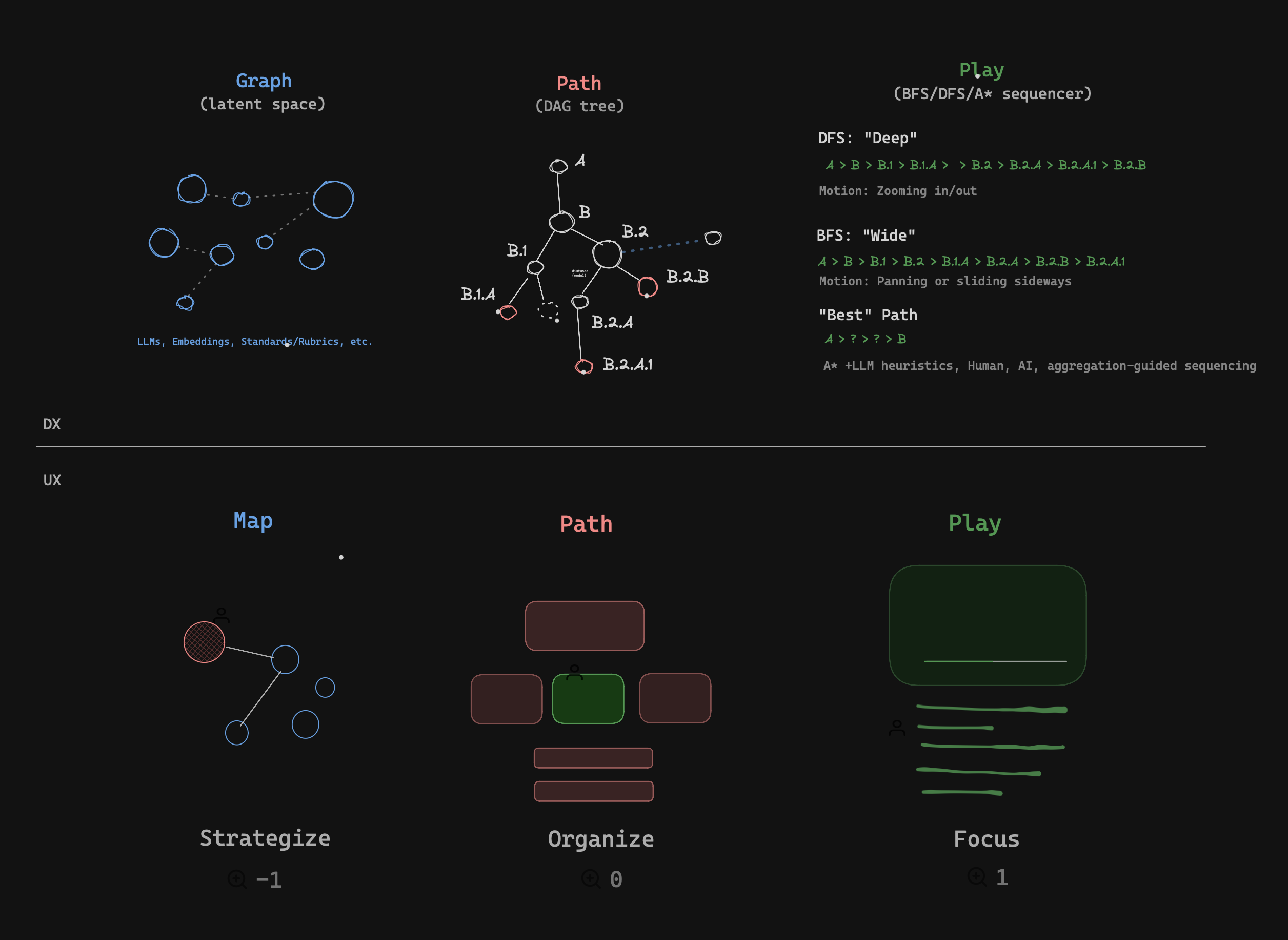
The image scales inside the stage and the guide falls back to its rendered
frame.
---
# A theme should support tone
> Strong hierarchy and useful defaults should make ordinary Markdown feel
> deliberate before an author reaches for custom CSS.
---
# 5 built-in themes
Paper, Studio, Terminal, Glass, and Bauhaus all use this same presentation.
---
# A deliberate overflow test
This slide carries enough material to exceed the comfortable one-slide budget
at narrow widths. Desktop presentation should keep the content readable inside
the viewport when it reasonably can. Mobile presentation should prefer a
single-column, vertically scrollable slide over shrinking type until it is
unreadable. The collapsed control remains reachable above the safe area while
the content keeps normal selection and link behavior.
- The heading stays visible.
- Body copy keeps a readable measure.
- The slide may scroll internally on a phone.
- Beat navigation reveals the active item without jank.
---
# Controls support the content
The expanded palette contains mode, intensity, Beat Guide visibility, controls
visibility, and Stop Play. Its collapsed form should disappear from attention,
not from reach.
---
# Continue reading
[Open the theme matrix](./theme-gallery.demo.md) or
[return to the reading example](./play-reading.demo.md).